


How to Choose Custom Colors for Felt Floral Decor
Table of Contents
- How to Choose Custom Colors for Your Felt Arrangement
- Color Theory for Floral Design: A Practical Starting Point
- Best Practices for Choosing Custom Color Schemes
- Building a Mood Board and Selecting Swatches
- Matching Custom Colors to Your Existing Decor
- Custom Felt Wedding Floral Decor: Color Choices That Work
- Accessibility and Cross-Device Color Consistency
- Conclusion
- Frequently Asked Questions
Last Updated: October 4, 2026
How to Choose Custom Colors for Your Felt Arrangement
Choosing custom colors for a felt floral arrangement starts with one decision: what feeling should the piece create in the room? At Felted Flowers, we have hand-felted every bloom one at a time since founding our studio on Saltspring Island, and the color conversation always comes before the flower list.
This guide covers reading the color wheel, building a mood board, matching your decor, and testing choices before you commit.
Color Theory for Floral Design: A Practical Starting Point
Color theory for floral design is the study of how hues relate to each other and how those relationships shape an arrangement's mood. You do not need an art degree to use it; three ideas carry most of the weight.
The Color Wheel and Why It Matters for Felt Flowers
The color wheel arranges hues in a circle, and the distance between them predicts how they will look together.
- Analogous colors sit side by side: pinks, corals, and soft reds. Calm, cohesive, hard to get wrong.
- Complementary colors sit opposite: green against red, blue against orange. High contrast and high energy.
- Triadic colors form a triangle: three hues spaced evenly apart. Playful, but easy to overdo.
Felt holds color differently than fresh petals. Wool's soft, matte surface lowers saturation, so colors that look loud on a swatch card often settle into something gentler once felted.
The 60-30-10 Rule for Balanced Arrangements
The 60-30-10 rule splits any arrangement into three roles: 60 percent dominant color, 30 percent secondary, 10 percent accent. For a felt bouquet, that might mean soft cream as the base, dusty sage as the support, and one deep plum bloom as the focal point.
Most first attempts fail here. People buy equal amounts of every color they like, and the result looks busy rather than rich.
Best Practices for Choosing Custom Color Schemes
Strong custom color schemes follow a few repeatable rules. Start with the room, not the bouquet, and work in a fixed order.
- Photograph the space in daylight and look at the photo, not the room. A phone shot exposes the green cast your brain edits out all afternoon.
- Note the two or three colors that already dominate: walls, furniture, textiles. Write them down as words, not feelings.
- Choose a dominant felt color that either matches or deliberately contrasts with those.
- Limit yourself to three hues plus a neutral tone. The neutral is not a filler; it is the pause that makes the other three read as intentional.
- Test your picks against the room's lighting. Warm bulbs push cream toward yellow and cool daylight pushes sage toward grey, so one swatch can read as two colors in a day.
One more rule matters as much: decide what the arrangement is for. A gift for a neutral-toned home should not be built around hot magenta, no matter how good it looks in the studio.
Why the Emotional Read Comes Before the Hue
Most guides stop at "pick colors you like," the weakest starting point, because liking a color in isolation tells you nothing about how it behaves next to two others.
Felt and textile designers commonly sort palettes into emotional registers and pick the register before the colors:
- Calm and grounded: muted, low-saturation hues with a narrow value range. Dusty sage, oatmeal, soft clay. The eye has nowhere to jump, so the arrangement reads as restful.
- Warm and welcoming: analogous hues clustered around orange and red, with one lighter tone to keep it from going muddy. Terracotta, blush, warm cream.
- Bright and playful: triadic or split-complementary hues at full saturation. These need a neutral to survive; without one, three loud colors compete and the piece looks accidental rather than joyful.
The mechanism is simple: saturation and value contrast do more emotional work than hue itself. Two opposite-wheel colors at the same lightness and saturation read calmer than two neighboring hues with a big value gap.
The Trade-Off Nobody Mentions
Every palette decision costs you something. High-contrast complementary schemes are striking but hard to balance and unforgiving in photographs. Low-contrast analogous schemes are cohesive but can look flat when small.
Interaction Design Foundation's guide to color theory explains how hue, saturation, and value interact, which helps when you are translating a paint chip into felt. The same three variables govern how a palette will read once the wool softens the saturation.
Building a Mood Board and Selecting Swatches
A mood board collects images, fabric scraps, and color notes to capture your direction before you order anything, turning a vague idea into something you can point at.
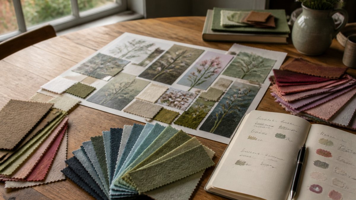
Here is how we would build one:
- Gather five to eight images that share a feeling, not a subject.
- Cut physical swatches where you can. Screens lie about color.
- Arrange them and remove anything that fights the rest.
That last step matters more than people expect. A color that looks right on one screen can arrive looking different, and a written code removes the guesswork.
Matching Custom Colors to Your Existing Decor
Matching existing decor is easier than starting from scratch because half the decisions are made for you. The trick is choosing harmony or contrast.
- Harmony: pull one color from the room and build around it.
- Contrast: pick a hue opposite to the room's dominant tone for a focal point.
- Neutral base: use cream, oatmeal, or soft grey felt, then add one accent.
If you are ordering for a space you cannot see in person, ask for photos in natural light. Our Mix n Match Iceland Poppies come as single stems at $19, or three for $49, making it easy to test a palette before committing.
Singles Mix and Match Iceland Poppies - pick 3 colours. →

Custom Felt Wedding Floral Decor: Color Choices That Work
Wedding palettes need one extra rule: they must survive photographs, not just look good in person. Custom felt wedding floral decor has an advantage here, because the flowers never wilt between ceremony and reception.
A few combinations hold up well:
| Palette | Dominant | Secondary | Accent | Best For |
|---|---|---|---|---|
| Soft romantic | Blush | Cream | Sage | Outdoor ceremonies |
| Vintage garden | Dusty rose | Muted green | Plum | Heritage venues |
| Modern minimal | Ivory | Warm grey | Charcoal | City venues |
| Bold seasonal | Terracotta | Rust | Deep gold | Autumn weddings |
Pick two palettes, not five. A tight scheme photographs better and costs less to build.
For couples who want something personal, our Custom Bouquet with Pinks and Greens and a Vintage Vase at $228 shows how a two-tone scheme can carry a whole piece. If you would rather start small, the A Cup of Spring mini arrangement at $39 lets you name your favorite color and see it in person first.


Accessibility and Cross-Device Color Consistency
Accessibility rarely comes up in floral design guides, and it should. Roughly one in twelve men has some form of color vision deficiency, so a palette relying on red-versus-green contrast alone reads as one flat tone to some guests. The same applies to any arrangement photographed, printed, or viewed on a screen.
Designing for Color Vision Deficiency
Two fixes work well, and they stack:
- Add lightness contrast, not just hue contrast. A pale pink next to a deep burgundy reads clearly to almost everyone, because the difference survives even when hue information is lost. A red bloom next to a green one at the same lightness does not.
- Pair color with shape or texture. Felt is unusually good at this. A smooth rolled petal next to a fuzzy layered one gives the eye a second cue, so the arrangement still makes sense in greyscale. Vary petal size and density alongside hue.
A quick self-check: convert a photo of your arrangement to greyscale on your phone. If the blooms merge into one grey mass, the palette is carrying all its meaning in hue, and some viewers will miss it.
What the Contrast Standard Actually Says
The Web Content Accessibility Guidelines on contrast set the standard most digital designers follow. The relevant thresholds are a contrast ratio of at least 4.5:1 for normal text and 3:1 for large text and graphical elements. You are not typesetting a website, but the numbers are a useful proxy: if two colors in your palette would fail a 3:1 ratio against each other, they will also read as a single tone to a viewer with reduced color discrimination.
Cross-Device and Cross-Material Consistency
Cross-device consistency is the other half, and where most custom color orders go wrong. The same bouquet photographed on a phone, printed in a program, and viewed on a laptop shows three slightly different colors. The causes are concrete:
- Screen calibration. Consumer displays ship with different white points and gamma curves. An uncalibrated laptop screen can shift a muted green noticeably toward blue.
- Color space. Screens render in RGB, print renders in CMYK, and some CMYK greens and oranges simply cannot be reproduced in RGB, or vice versa. A vivid teal that looks right on screen can print duller than expected.
- Material. Wool has a matte, light-absorbing surface. A hex code that looks bright on a glossy screen will read lower in saturation once it is felted, because the fiber scatters light instead of reflecting it.
A practical workflow that avoids most of this:
- Save your palette as hex or RGB values, not as a screenshot. Codes travel; images do not.
- View the codes on at least two screens, ideally one phone and one desktop, in the same lighting.
- If the piece will be printed anywhere, ask for a physical proof or a printed swatch rather than trusting the screen.
- For anything you are stocking or selling, order physical felt swatches. They are the only reference that matches the final material.
None of this is overkill for a decorative object. It is the difference between a palette that holds together in the room, in a photograph, and in a printed program, and one that only works in the conditions you first saw it.
Conclusion
Color is the part of a felt arrangement people remember, and the part most rush. Build the palette first, test it in real light, and check it on more than one screen.
That is the work we do on every piece at Felted Flowers. Each bloom is hand-felted from Merino wool and recycled polyester felt blends, designed one flower at a time, with custom bouquet design available when you want something built to your exact colors.
Get started with Felted Flowers and turn your palette into a lasting arrangement.
Frequently Asked Questions
What is the 60-30-10 rule for choosing custom colors?
The 60-30-10 rule is a proportion guideline: use 60% of a dominant color, 30% of a secondary color, and 10% of an accent color. For felt floral arrangements, this means most of your flowers sit in one main hue, a third in a supporting tone, and a small number in a bold accent. This balance keeps the arrangement from feeling chaotic and helps the eye move naturally across the piece.
How do I choose custom colors that complement my existing home decor?
Start by pulling three to five colors already present in your room, whether from a rug, cushion, or wall art. Bring those swatches or photos when ordering. A custom bouquet in soft pinks and greens, like the one arranged in a vintage vase, works well in rooms with warm neutrals. For cooler spaces, choose blues, lavenders, or muted greens. The goal is harmony, not a perfect match.
Can custom colors be matched to specific fabric swatches or paint codes?
Yes, in most cases. Felted Flowers works with Merino wool and recycled polyester felt blends, and the team can reference your paint code, fabric swatch, or hex code when selecting felt. Because natural wool has slight variation, expect a close match rather than an exact digital replica. Sending a physical swatch by mail gives the most accurate result for custom felt wedding floral decor.
What are the best color combinations for custom floral arrangements?
Analogous combinations, like pink and coral, create a soft, cohesive look. Complementary pairs, such as deep blue and warm gold, add energy. For a timeless feel, pair neutral tones with one accent color. If you want a bouquet that suits both modern and traditional spaces, stick to two primary colors and one accent. The Mix n Match Iceland Poppies let you test combinations before committing to a larger arrangement.
Leave a comment